
Create a seamless cross-channel experience with Powform
Making your content accessible on every type of device is a must these days. Although the percentages change from sector to sector and from business to business, it's no longer safe to assume that your audience is using a desktop computer. In lots of markets, particularly in B2C, customers are overwhelmingly using smartphones to access the internet.
This means that cross-platform performance is an important consideration when planning any kind of online shop, app, or website. Lots of designers and developers will actually start with the mobile design first, and move onto desktop design only once this is finalised. If you start with the desktop design, it's vital to allow time to work on the mobile experience and ensure that everything works just as well on smaller screens. If you are working on a web app, cross-platform performance is absolutely crucial because you're not just presenting information, like on a blog or web page, but asking your users to carry out some kind of task.
What is a web app?
Web apps are programmes that people access using their web browsers, including the browser on their phone. To the user, they just look like a website, but they are capable of doing much more than a standard website. Web apps can help people to complete jobs or transactions. Some simple examples are sending an email, processing a payment, or booking a ticket. Because web apps run in the browser, it doesn't matter if the user is on a computer or smartphone, or what platform their device uses (Android, Apple, etc.). You can develop a web app from scratch using programming languages, or you can opt to use a no-code or low-code platform like Powform.
Building a web app
It's important to consider the functionality (the parts that "do" something) and content (the parts that explain or inform) of your web app when coming up with your design. You will probably want your page to be eye-catching and draw the user in, but you must then hold their attention and ensure they are able to complete the task they are there for without being distracted, confused, or turned off. This means checking to ensure that a feature that works well on desktop doesn't become really cumbersome on mobile.
Designers use a technique called wireframing for the early stages of concept design. This is like a sketch of a design that shows where everything will go. A wireframe is essentially a layout prototype, and you'll create one for each step of the process. This allows for rapid testing with a focus group, where the flow of the app can be decided on through feedback from real life users. Components can be rearranged, taken away, or added in to make the process smoother. There are lots of wireframing tools online if you want to give this process a try, a few examples are Figma, iPlotz, Balsamiq, and Axure.
If you don't want to create a wireframe, you can just dive straight in and start putting your idea together with our drag-and-drop form builder. Because Powform is a no-code platform, all the components are ready for you to piece together instead of having to code them from scratch. We aim to make cross-channel performance a breeze, which is why all the features you'll find in our form-builder work on all platforms, regardless of brand or operating software.
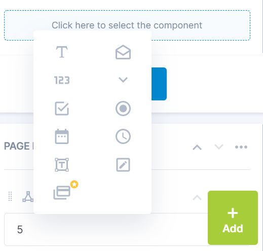
Powform’s flexible component menu

Our menus and features are fully accessible across all platforms, they can be moved using 'click and drop' or 'drag and drop'. On smartphones, where a user interacts using a finger or a stylus, the speed of the motion is just as fast as it would be on a desktop. Powform makes use of touch events (touchstart, touchend, touchcancel) to improve the overall user experience (UX) as relying on just drag and drop for a mobile app can be clunky.
The difference between mobile design and desktop design
Laptops and desktop computers have larger screens and users can therefore see more components at once, as well as being able to quickly move up and down a page using a mouse scroll wheel or browser scroll bars. Desktop design will consider how the information is presented to keep the customer scrolling or progressing through the task they are trying to complete. Information or functionality may be presented using columns, drop down menus, sidebars, etc.
On mobile apps, users can see less information, so it's important to prioritise what content and features they see. Components may fight for space on the screen, so consider how you present each element. For example, if you are using a drop-down menu or list, can they see all the choices or are some hidden from view? Designers tend to simplify designs on mobile to help maintain focus and ensure form completion rates stay high. The number of steps required to complete a task is also a consideration.
As with any kind of product design, letting real users test the experience on different devices can provide really valuable feedback for improving designs and overall user experience.
Design and build with Powform
With Powform, you can begin building your branded web app on your desktop and save your progress. You can then pick up where you left off on mobile with no loss of features or operations and rebuild or just put the finishing touches on your project. Build a form from scratch without compromising on functionality!
The team is working on a host of upcoming features, which will of course work just as well on desktop or mobile. And if there is something you need that we don't cater for, remember that at Powform we also offer custom development services - our platform is so robust we can meet almost any requirement, whether you're an SME or large enterprise.
Keep an eye out for these upcoming feature releases too:
- File upload
- Stop and start flows
- Reports
- Calculators
- Conditional logic
- End-to-end encryption
- Data storage and exporting
- Single Sign-On (SSO)
Related Articles

Manage your restaurant or cafe with Powform
How to build a better form with conditional logic
Highly Configurable - No Coding
Build professional and fast branded e-commerce and customer data collection web apps, no coding experience needed. Scalable solutions that can be built and integrated into your business in minutes.
Powform enables you to create branded, interactive, multi-feature apps for mobile and desktop browsers, including all the smart features you need to collect customer data and payments. With the addition of conditional logic you can provide a more tailored experience for your customers.
Our managed secure database allows you to store and analyse all submitted web app data.
Want to store all app data in house?
App submissions can be directed to other business systems via secure authenticated api services.
Contact us today to discuss your custom branded no-code web apps requirements.