Form Fields - Basics
Master the Art of Form Field Customisation with Powform’s No-Code Form Builder
Ever tried building an online form and ended up feeling like you needed a computer science degree just to add a simple dropdown? You’re not alone. If you're searching for a simple, no-fuss no-code form field editor, say hello to your new best friend: Powform.com.
Whether you’re creating sleek contact forms, quick surveys, or full-blown registration forms, Powform gives you insane flexibility without the tech headaches. Ready to learn how to create smarter forms with smarter fields? Let’s dive right in!
Why Powform.com is the Perfect Platform for Form Field Customisation
When it comes to form field customization, you want power, but you also want simplicity. Powform makes it possible to design professional-grade forms without ever touching a line of code. It's like having a Swiss Army knife for form building—everything you need, packed into one powerful tool.
From basic form field settings to more advanced tricks like form field conditional logic and form field visibility settings, Powform hands you the tools to build forms that don't just collect information—they work for you.
Need to set up form field labels and descriptions? Want to control where and when certain fields appear? Whether you're after mandatory fields in forms or dynamic, hidden sections that only appear under certain conditions, Powform’s got you covered.
And if you really want to get fancy, check out the insane flexibility of their form fields advanced phone functionality—you'll feel like a pro in no time.
Top Features That Make Powform's Form Field Customisation a Game-Changer
Let’s break down why Powform is the real MVP when it comes to easy form field customisation.
Ultimate Control Over Every Form Element
Imagine sculpting a masterpiece out of clay—but instead of clay, you’re crafting brilliant, functional online forms. With Powform, every field you add can be moulded to your exact needs.
Want to set default values in form fields so users get a head start? Need text field character limits to avoid long-winded responses? Prefer setting up number field value ranges to control input precision? It’s all as easy as a few clicks.
If you’re wondering about dropdowns, don’t worry—Powform is a stellar form builder with dropdown options, complete with seamless dropdown field configuration.
And let's not forget about adding checkbox and radio button groups. Whether you’re giving users multiple choices or locking them into one, configuring these fields feels effortless with Powform.
Looking for a platform that offers powerful features without overwhelming you? Powform checks all the boxes.
Validation, Alignment, and Everything in Between
Building forms that look good and work flawlessly? That’s where Powform’s magic shines even brighter. Their form builder with validation options lets you enforce form field validation rules without breaking a sweat.
For example, you can set up email field pattern matching to make sure people aren’t entering "notanemail.com" in your email fields. (We’ve all seen it happen, right?)
And because first impressions matter, you can tweak form field alignment options so everything looks clean and professional. Adding form field placeholders and form field tooltips? Also ridiculously easy—and they make your forms more intuitive for users.
Need your fields to guide users step-by-step? Powform even allows you to set form field tab order, keeping the flow smooth like butter.
Advanced Field Settings for Power Users
Alright, let’s say you’re feeling ambitious. Maybe you want certain fields to only appear if a user answers "Yes" to a question. That’s where form field conditional logic becomes your secret weapon.
Or maybe you want to group related fields together for a more organised layout. Yep, Powform offers grouping form fields too.
Best of all? You can still create forms with required fields easily, ensuring no one skips the info you need most.
It's like having a toolbox that grows with your skills—the more you explore, the more you can build. And thanks to the intuitive design, you won’t be left scratching your head.
Common Properties
Each component has both common and specialized properties. The common properties are generic and common to all form components.
Labels
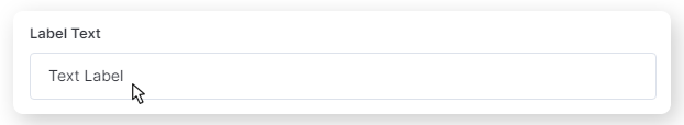
Labels are the name of a field, indicating to the users what they are supposed to type in the field.
For example, you can change the Label Text from the Email Component to just “Email” or “Insert your e-mail below”.
Descriptions
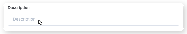
Use this property to write a brief, short and easy-to-read description for the field.
This description will appear under the inserted field and can be used for:
- Explain why the user should fill this field
- Clarify what is the field’s purpose
- Eliminate any possible misinterpretation
- and more
Mandatory Fields
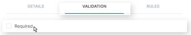
Almost all of the components will show a Required checkbox under the “Validation” tab. You can select it to make a field in a form mandatory.
A required field will be represented with an asterisk (*) right in front of it. Users will only be able to proceed with the form by filling the field with proper information.
Specialised Properties
Some fields have specialized properties which distinguish themselves from others.
These unique configurations bring a new level of customization for specific components!
Default values
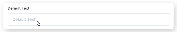
Present in almost all of the components, these are default texts/dates/times/emails, numbers, descriptions, etc. for each form, functioning as an example of how the user should type information.
Depending on the component you insert on the page, the default may be text, name, time, e-mail, number, and more.
Some components only accepts specific characters or formats. The the Number Component will only accept numbers as default, for example.
As for the Email Component, the default should have and email format. E.g.“example@example.com” or “sample@sample.net”.
Minimum and Maximum
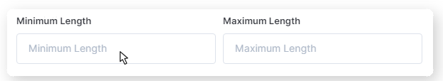
Under the Validation tab, you can use Minimum and Maximum property to define required and limit the amount of characters the user can insert in a field.
This property can be set for:
- Text Component: define minimum and maximum length of a text
- Number Component: define minimum and maximum value that can be entered
You can also set a limit for only one of the options, leaving a blank for the other one. For example, establish a minimum number of characters for a field, but don’t set a ceiling.
Group Name
Present in CheckBox and Radio Component under the tab Options, this property allows you to name the group of fields which can be checked by the user.
Simply insert the name of the group to indicate what the following checkboxes are supposed to represent.
Default Label
This is a default label for selecting options in the Dropdown Select component.
However, you can check “Hide Default Label” to hide it from the user.
Default, Label and Value
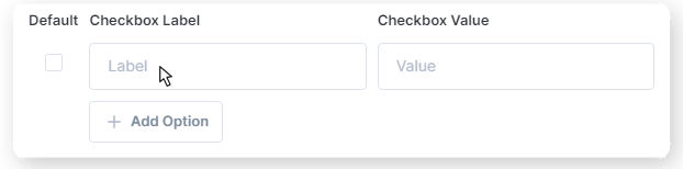
You’ll find it while customizing multi-select Components, like Dropdown Select, CheckBox and Radio.
There’ll be a Default Checkbox, which can be selected to make an option pre-selected, but also allow the users to freely change it.
The label properties are the names of the options the user can checkmark.
In front of each label you can type values (both letters, numbers, and special characters), which are registered internally in the form. Only you will be able to see the value of each field from the group.
Next, you can just click on Add Options to add more options on default, label and values.
Regular Expression Pattern
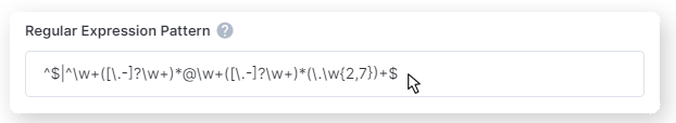
Only present in the E-mail Component. This is a description of patterns that match combinations of characters in strings.
Powform delivers this property already filled, so you don’t have to go through all the trouble to write it.
If you don’t know what to change in this property, you can just leave as it is and the field will work perfectly!
Time Format
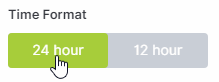
This property changes the time format the user can select in a Time Component.
You can select 24 hours or 12 hours (also giving option to choose between AM or PM)
Step Minutes
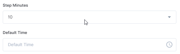
Allows the user to select time by each minute, or every 5, 10, 15, or 30 minutes.
Try to configure your field’s properties now
How Powform Helps You Customise Fields Without Losing Your Mind
Let’s be honest—some platforms make customize form field properties feel like trying to untangle a ball of Christmas lights. Not Powform.
Whether you’re setting up a basic lead capture form or creating a complex order form with multiple sections, Powform’s form builder with basic fields makes it feel natural. You won’t be buried under endless settings you don’t understand. Everything is labelled, streamlined, and built with actual humans in mind.
And if you're worried about making mistakes? Relax. Their platform makes editing and updating your fields painless. Plus, if you ever want more advanced options like the form fields advanced phone setup, it’s just a few clicks away.
Need a quick overview of all the customization you can do? Trust me—one peek at their features page will have you feeling like a form-building rockstar.
Conclusion: Powform Makes Form Field Customisation as Easy as Pie
If you've been dreaming of a form builder with default values, basic fields, and true flexibility without needing to code, your dream has officially come true with Powform.
Whether you need to add mandatory fields in forms, set up clever form field validation rules, or dive into more sophisticated stuff like form field conditional logic, Powform gives you all the tools—and none of the headaches.
Don’t waste another second struggling with outdated platforms that make simple tasks feel impossible. Build smarter, faster, and better with Powform. Start exploring their form fields advanced phone features and full suite of features today, and create forms that work as hard as you do.
Trust me—you'll wonder how you ever managed without it.
Highly Configurable - No Coding
Build professional and fast branded e-commerce and customer data collection web apps, no coding experience needed. Scalable solutions that can be built and integrated into your business in minutes.
Powform enables you to create branded, interactive, multi-feature apps for mobile and desktop browsers, including all the smart features you need to collect customer data and payments. With the addition of conditional logic you can provide a more tailored experience for your customers.
Our managed secure database allows you to store and analyse all submitted web app data.
Want to store all app data in house?
App submissions can be directed to other business systems via secure authenticated api services.
Contact us today to discuss your custom branded no-code web apps requirements.